Shared Language for Speed
Project Overview
When structure fuels creativity
The Guðmundur Design System was born from a simple observation: design doesn't scale if you keep resetting. By defining the rules behind the interface, we freed ourselves to focus on the problems that actually matter.
The Challenge
The issue wasn't just that buttons looked different on different screens. It was that design and development were drifting apart. Without a shared system, every new feature required a re-explanation of the basics. We faced:
- drift between design and code
- decision fatigue over basic UI elements
- fragmented user experience
- slow developer handoffs
Insight & Approach
Designing the rules, not just the screens
A design system isn't a UI kit: it's a shared language. We shifted our focus from refining individual screens to defining the logical foundations that govern them. This shift in perspective allowed us to build with rhythm and flow.
The Approach
Our system is anchored in three pillars:
- Clarity: Interfaces should be easy to read and scan instantly.
- Flow: Interactions should feel natural and uninterrupted.
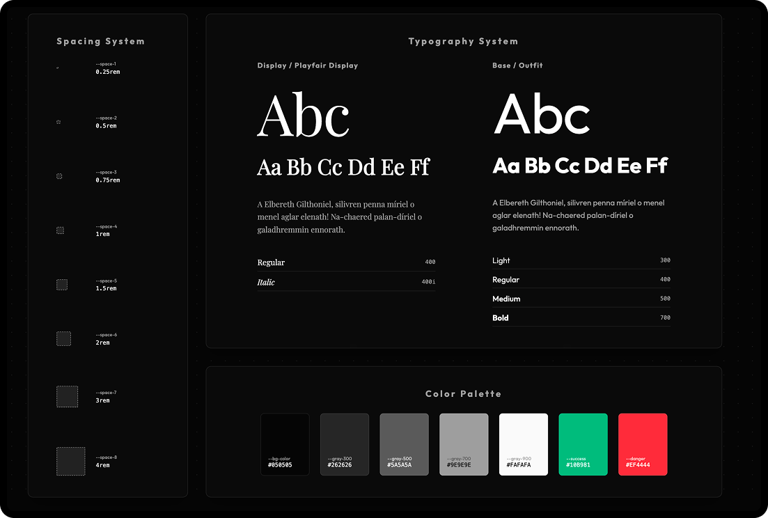
- Rhythm: Consistent spacing and grids create a sense of balance.
Key Changes
We bridged the gap between complex data and human intuition.
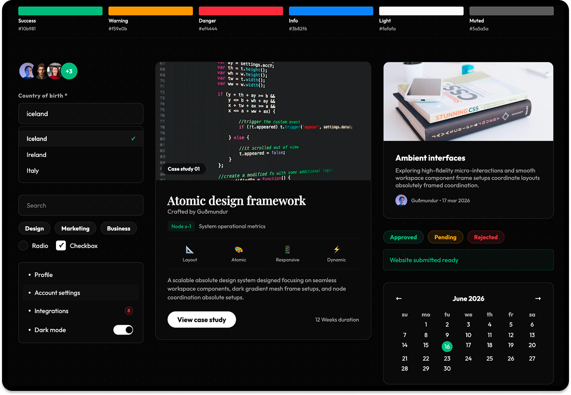
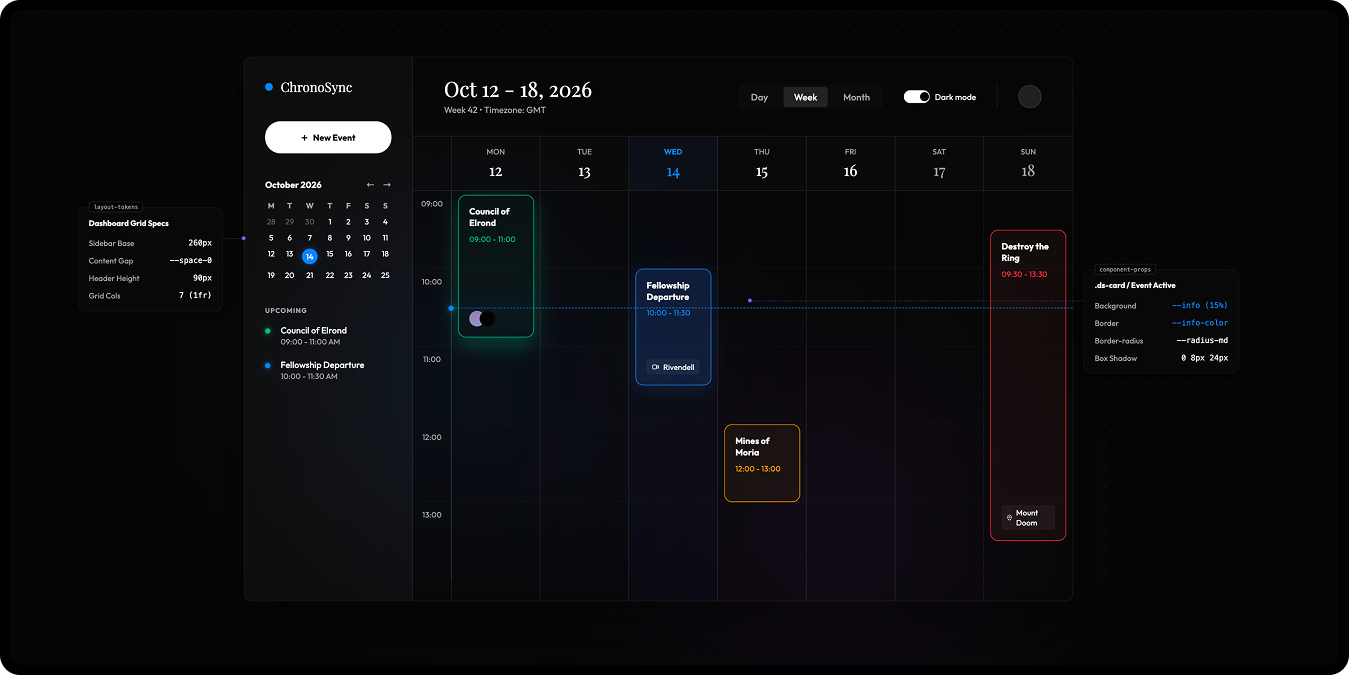
Semantic Token System
Moved away from hardcoded values to a flexible system of tokens that adapt to any context.
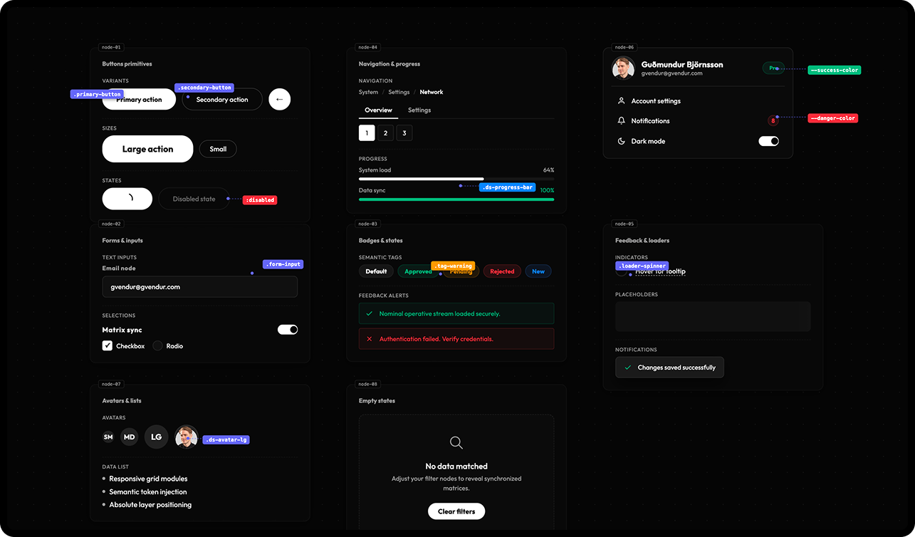
Atomic Component Library
Built a robust set of reusable components that ensure predictable behavior across the entire product ecosystem.
Interactive Documentation
Created a live dashboard where design and code live together, eliminating guesswork and speeding up execution.
Outcome
The biggest shift wasn’t visual: it was mental. We stopped asking "what should this look like?" and started asking "what system does this belong to?"
- drastically faster design-to-code execution
- absolute visual and behavioral consistency
- higher team confidence in shipping new features
Reflection
Good systems don't restrict creativity: they remove the need to rethink the basics. When the structure is clear, design becomes faster, sharper, and more intentional. That's the foundation of every successful product.