Humanizing Fitness Appointments
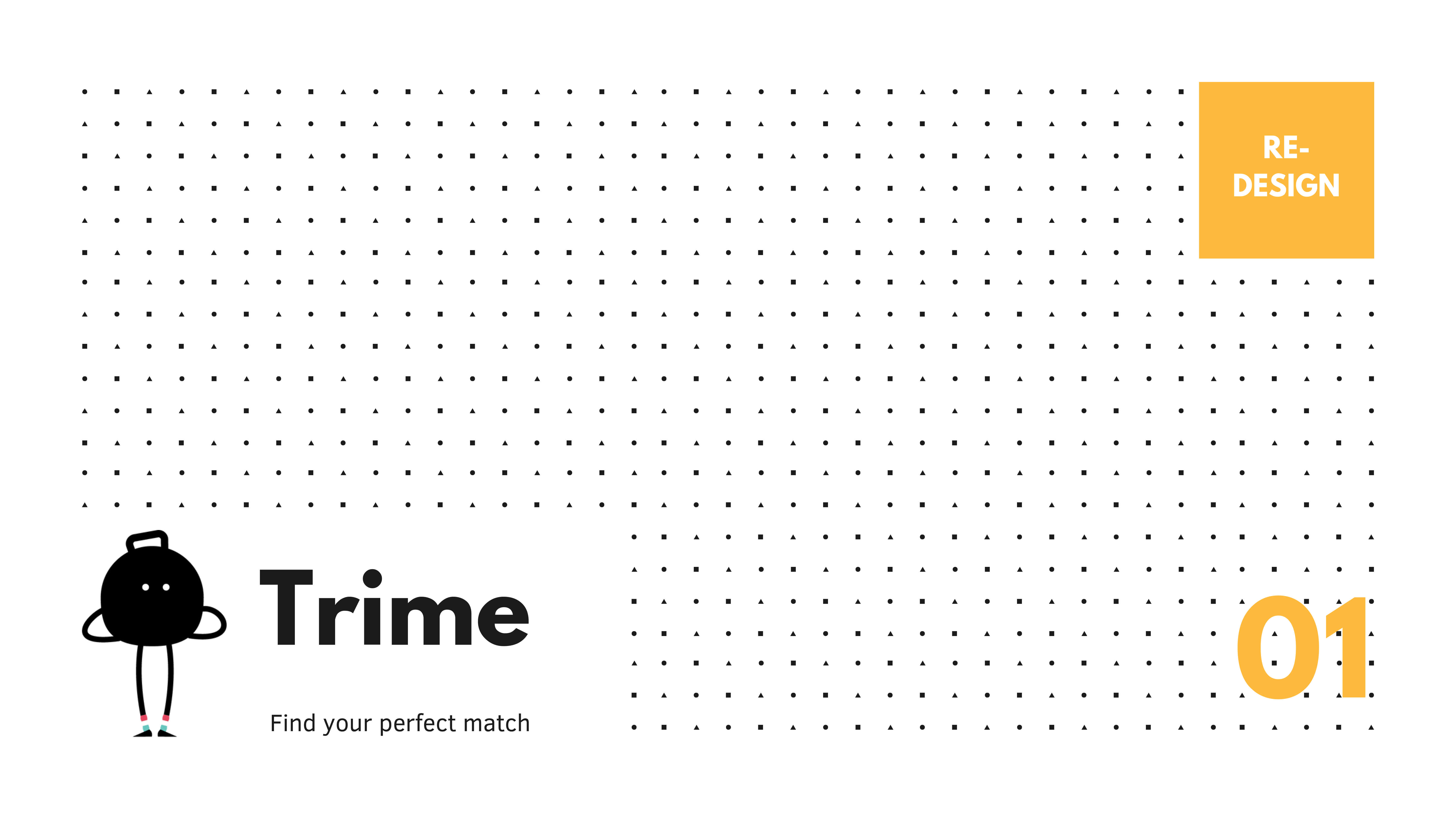
Project Overview
Moving from intensity to support
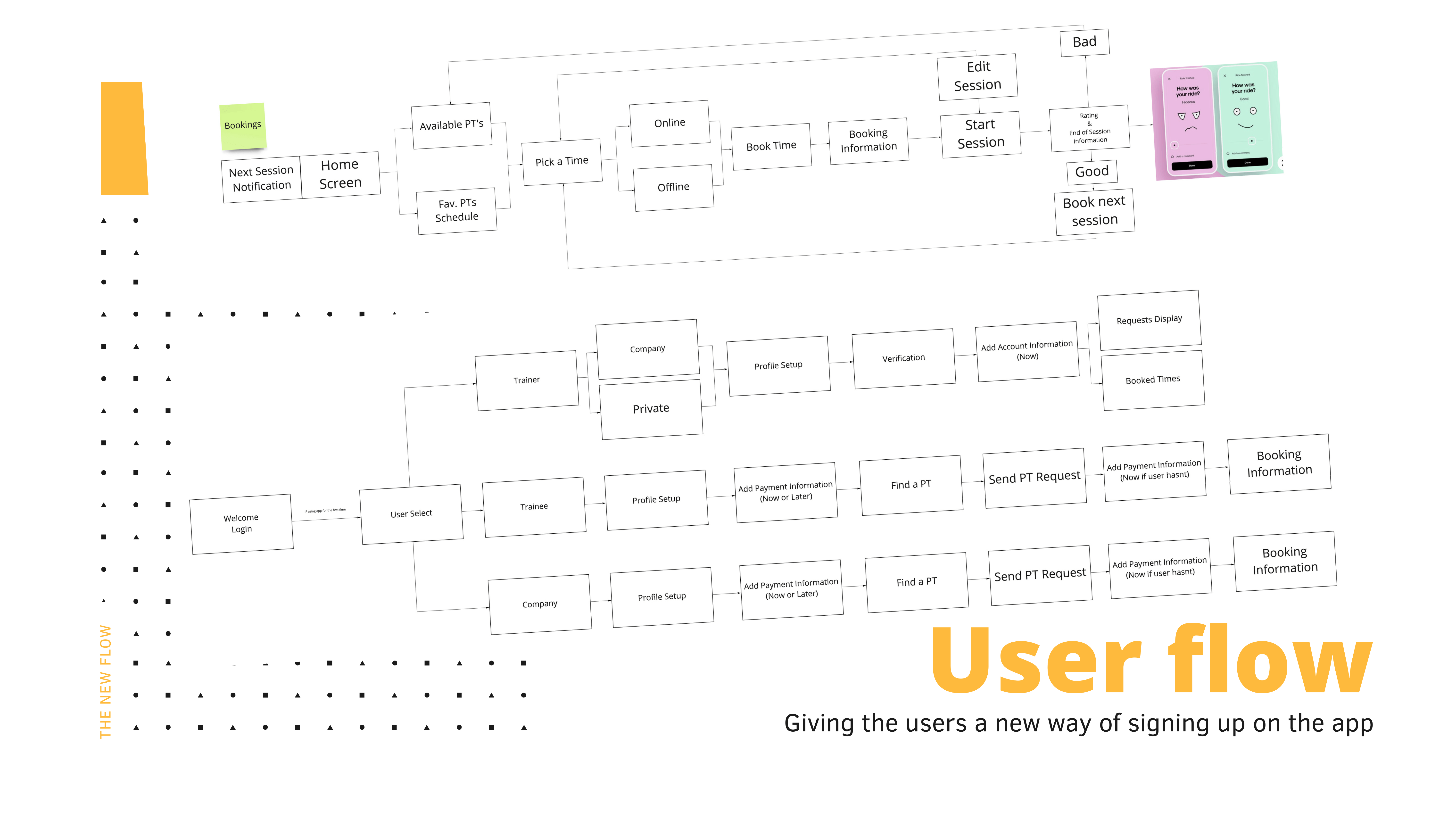
Our team partnered with Trime to redesign their fitness tracking experience. The goal wasn't just to add features, but to change the relationship between the user and the app. We wanted to move away from cold, clinical tracking towards a more human, conversational interface.
The Challenge
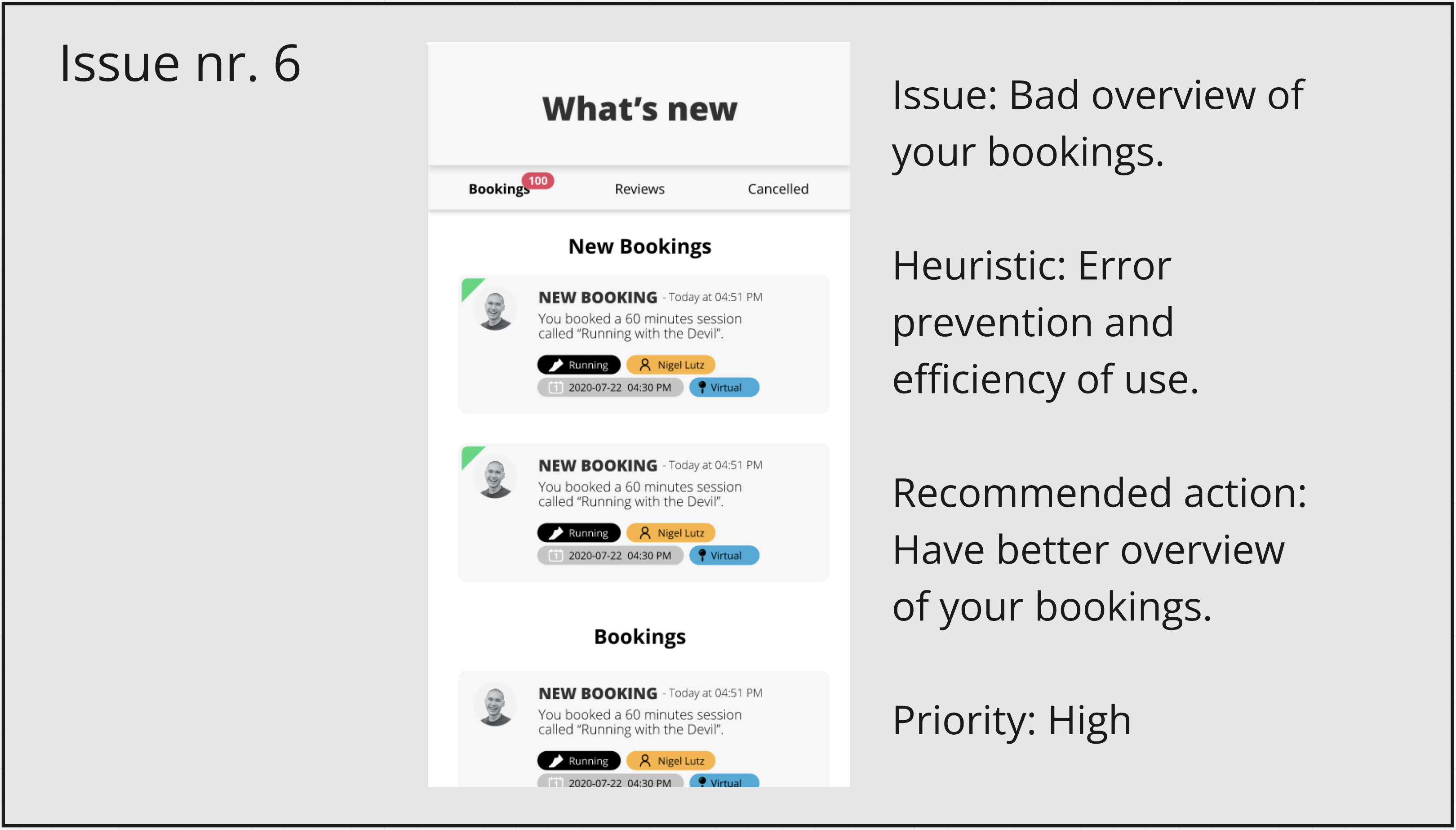
Trime struggled with the same problem many fitness apps face: high initial interest followed by a steep drop-off. The onboarding felt like an interrogation, navigation was cluttered, and booking a session was buried under layers of data. Users felt overwhelmed, not empowered. Key issues included:
- onboarding that felt like a form, not a welcome
- disorganized navigation that hid key actions
- a competitive tone that alienated casual users
- friction in the booking process
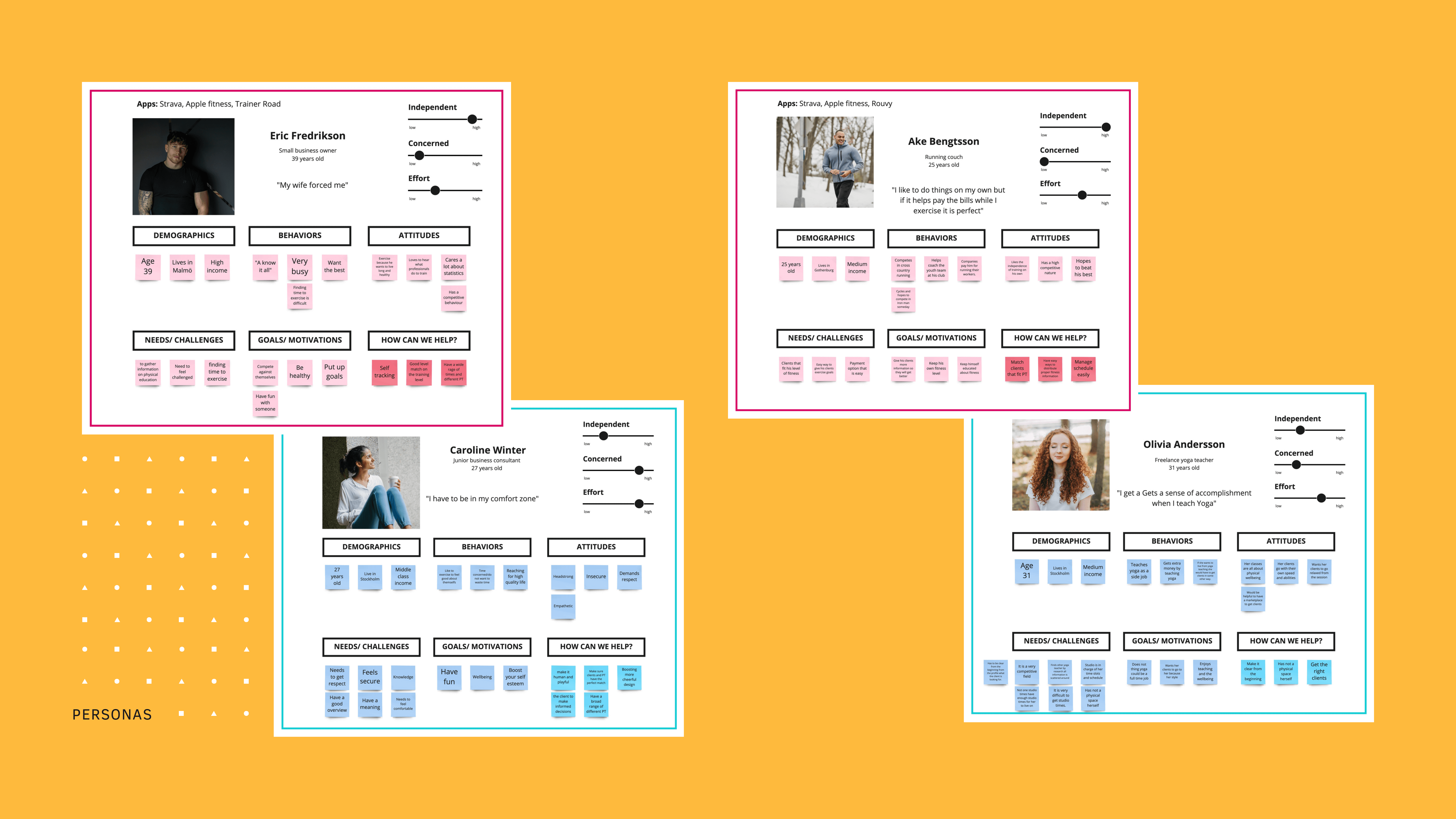
Insight & Approach
Empathy over tracking
Research showed that users don't need another drill sergeant: they need a partner. The gap wasn't in the functionality, but in the feeling. We realized that if we could make the app feel more playful and human, we could lower the psychological barrier to starting a workout.
The Approach
We anchored our design in three principles:
- Conversation: Turn forms into dialogues.
- Visibility: Put the most important actions front and center.
- Encouragement: Focus on progress, not just performance.
Key Changes
We bridged the gap between complex data and human intuition.
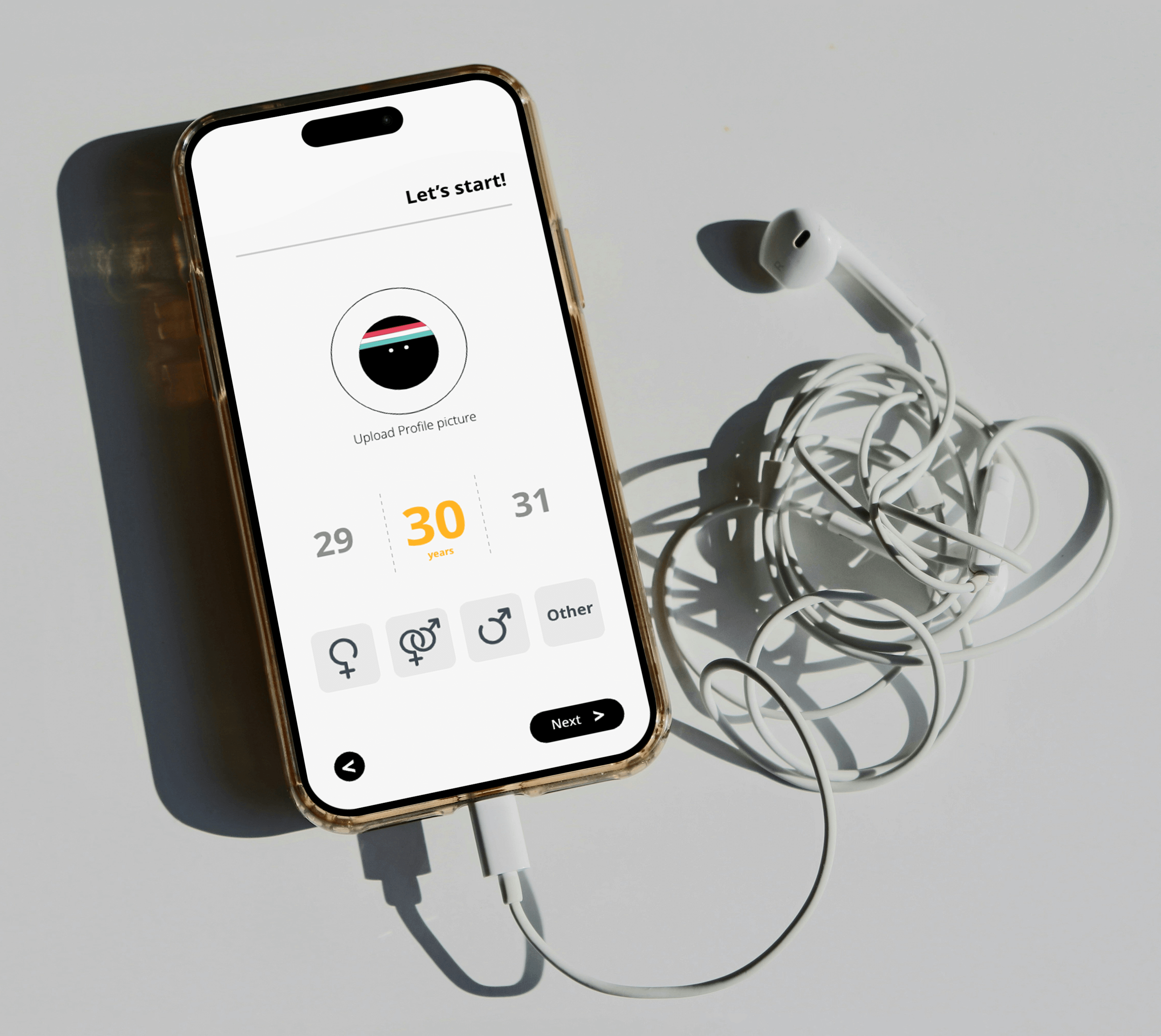
Conversational onboarding
Redesigned the first few minutes to feel like a friendly chat, helping users set goals while matching them with the right trainer.
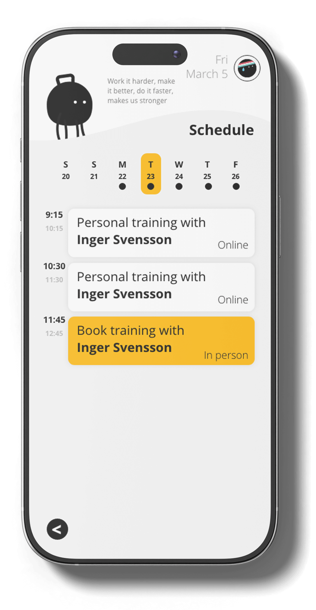
Prioritized booking
Brought the session booking feature to the top of the home screen, making the core task effortless.
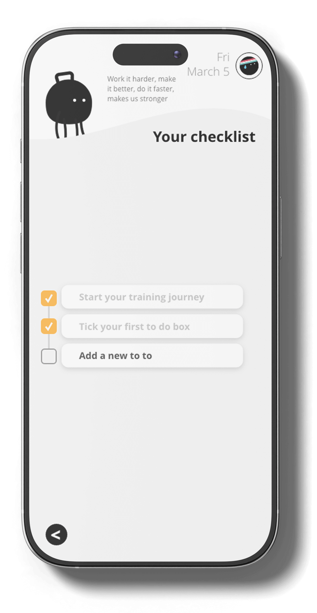
Personal checklists
Introduced a supportive daily checklist to keep users engaged on their own terms, even on rest days.
Outcome
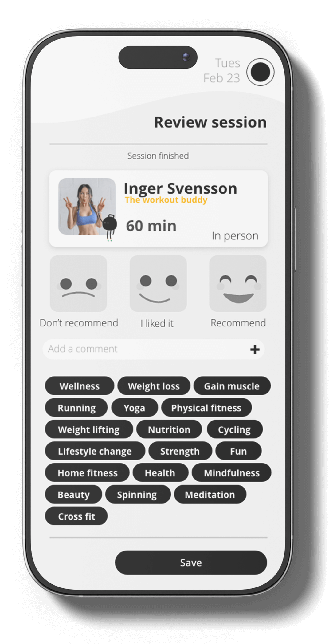
The redesign transformed the app into a more approachable and motivating tool. Qualitative feedback showed that:
- onboarding felt more supportive and less intimidating
- cleaner navigation led to faster task completion
- users felt a stronger emotional connection to their progress
Reflection
Design is as much about tone as it is about tools. By humanizing the interface and focusing on empathy, we can turn a stressful task into a supportive habit. That's the power of designing with feeling.
